

Hello Interactors,
Welcome to spring. We now transition to cartography. This post weaves the story of how I came to study cartography as an undergrad, the challenges of drawing maps, and how a spinning logo led to a mapping feature in Excel.
As interactors, you’re special individuals self-selected to be a part of an evolutionary journey. You’re also members of an attentive community so I welcome your participation.
Please leave your comments below or feel free to email me directly.
Now let’s go…
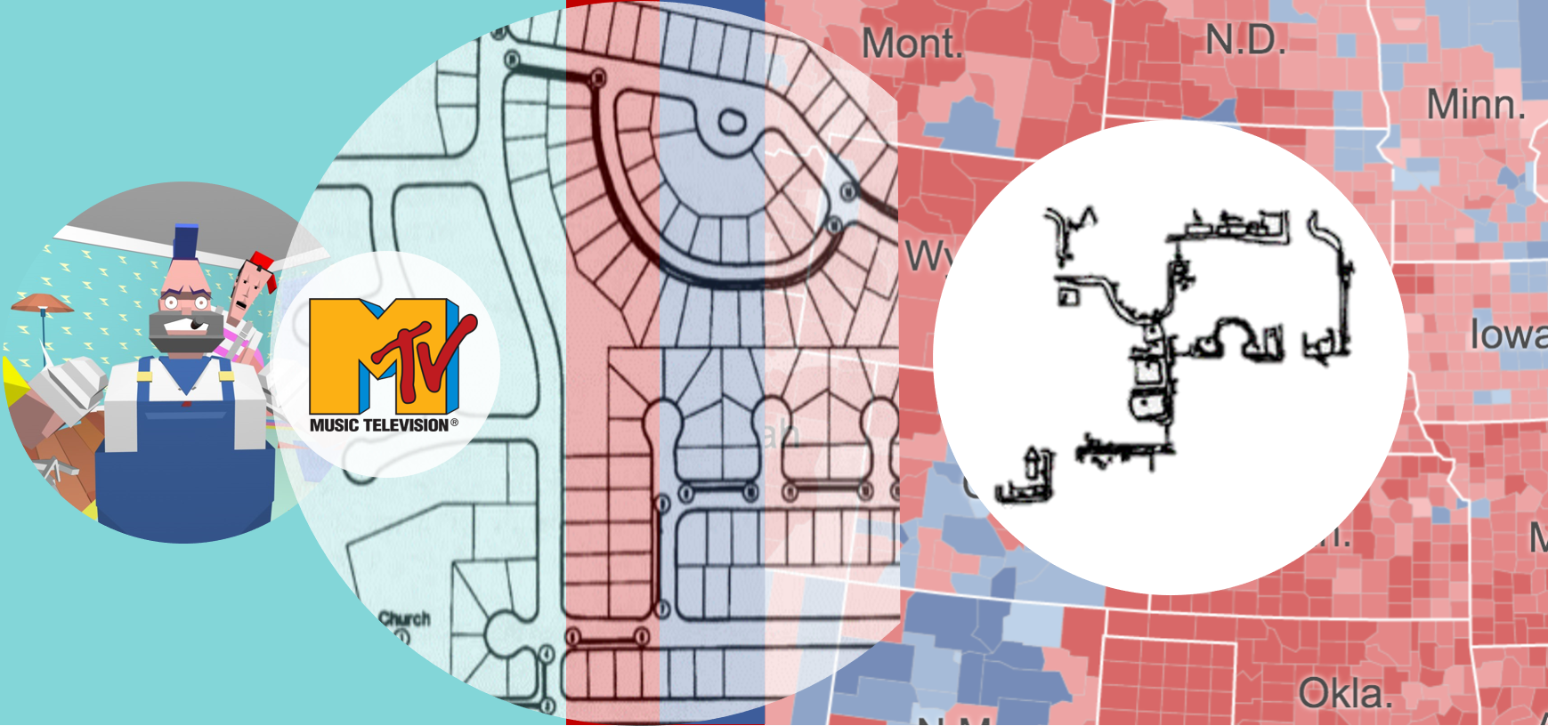
I didn’t set out to be a geography major. I didn’t even know the word ‘cartography’. My primary interest in high school was computer graphics. My two favorite subjects in school were math and art and I saw computer graphics as a way to combine them. I was also addicted to MTV. Yes, I was there for the music, but I was also in love with their animated logos.
That’s when I knew what I wanted to do when I grew up. Animate graphics with a computer.
Finding a university to teach me this proved elusive. I ended up following a high school friend to Colorado State where he was already studying graphic design. But toward the end of my fist year, the head of the design department settled with me, “Look Brad, I don’t think you’re going to find what you’re looking for here. You might try California.” So I loaded up the truck and I moved to Beverly. Hill’s, that is. Swimming pools, movie stars.
My cousin lived in L.A., so I moved in with her and her husband. I took a year off, worked, and searched for the right school. By this time, 1985, Dire Strait’s video, ‘Money for Nothing’, had come out. It’s was one of the first ever computer animated videos. It also featured Sting’s familiar cry, “I want my MTV…” I hear you, Sting. I still want my MTV. Having seen this video, I was even more certain of what I wanted to do. In a twist of fate, my cousin helped me land a job as a corporate gopher for a consumer electronics distributor. I was living that line from the ‘Money for Nothing’ video: “We gotta move these color TVs…”
In 1987, the popular computer graphic conference, SIGGRAPH, was in Anaheim so I attended. I was in heaven. These were my people. I found my way to a booth with a cool logo and name: Wavefront Technologies.

The people were cool too. Best yet, they were located in Santa Barbara. I decided I wanted to work for this company, so I headed north and enrolled at University of California, Santa Barbara. Then came the hard part. What do I major in?
Computer graphics was only offered in graduate level computer science courses. That seemed too long and arduous for my taste. I remember sitting there frustrated one day, thumbing through the course catalog my roommate had left open to his major, environmental studies. I saw a class offered by the geography department in mapmaking – cartography. As I looked further I found computer cartography. I soon realized I could learn computer graphics and graphic design through cartography. I then declared geography as my major and was finally on a path to my ultimate goal — Wavefront.
DRAWING ON THE BRAIN TO DRAW MAPS
Drawing maps is difficult. It seems easy. From last week’s post on cognitive maps we learned making maps comes natural to the brain. We all have what we need to draw a map right there in our head, but getting it to come out of our hand and on to paper is challenging. And error prone.
Around the time I started at UCSB, geography professor and mental map legend, Reg Golledge, conducted a study on the ability and accuracy of sketching a map from memory. Inspired by research dating back to the 50’s, the study focused on children. Young people have the cognitive skills to recognize anchor-points in the environment, but lack the skill, expertise, and experience in drawing maps.
Golledge had an 11 year old boy walk a designated path forward and reverse in his suburban neighborhood just off campus in Goleta, California. He repeated this path over the course of five days and was asked to write down his navigation strategy; including the list of landmarks and features used in his strategy. He then wrote down a list of steps required to complete the journey that another kid his age could understand. And, lastly, he had him draw a map. Similar to the Carr study mentioned last week, the boy was also shown a video of the journey and was asked to anticipate which landmarks would be next in the sequence of his path.

What Golledge found is that by day five, the boy was able to draw a fairly detailed map of the path. Like the Carr study, the more times the boy walked the path, the more detail the brain was filling in.

As you can see, the origin and destination of the journey were easier to sketch. Over time, other segments progressively filled in over time. But what’s interesting is the gaps found in the boy’s early maps weren’t there in his verbal description of what was to come next in the video. Even in early trials the boy could accurately describe what was coming next in the sequence watching the video, but he couldn’t draw it. His brain had the list of segments neatly ordered in his brain on day one, but drawing them completely and accurately took until day five.
There have been a number of similar studies conducted since. Including other methods of giving directions like pointing to a location with a finger or simply walking someone to a destination. What researchers have concluded about sketch maps is summarized here by Golledge:
“Of these various methods, pointing, sketch mapping, and walking to targets parallel research methodologies that have been used extensively in cognitive mapping. It is significant to note that perhaps the most prominent of these methods - sketching - was found to be among the least reliable! After evaluating nine different ways of indicating direction, [the research] showed that simply using a finger or a device extended like a finger (e.g., a stick) was the most accurate technique.”1
It turns out drawing maps is hard.
CHARTING A COURSE IN CARTOGRAPHY
One of the first things I learned in cartography is the best maps are copies an existing one. All of our mapping assignments used translucent paper (vellum) that we would lay over an existing map and trace by hand with a technical pen (Rapidographs). Old school. But I was a rebel. After spending four hours hand drawing a map assignment, I would walk three floors down to the computer lab and crank out the same assignment on a Mac in under an hour. Much to the chagrin of my TA (and now friend), Greg, I would hand both in just to prove a point. Computer cartography was upon us.
But the most valuable lesson Greg taught me wasn’t about how to unclog my pens or how to use the photo enlarger in the dark room to create glossy reproductions of our pen and ink masterpieces. It was how to blend data visualization with mapping. Most of the maps I remember drawing were choropleth maps. These maps are commonplace now. Probably best known for showing ‘red’ and ‘blue’ disparities by region during U.S. elections.
Here’s one from the 2016 election by the New York Times. It gives the illusion that most people in America voted for Trump. The choropleth doesn’t take into account how many people live in each county making the map somewhat misleading.

The New York Times has been doing choropleth election maps since 1896.

In 1992 they added a bar chart to give the reader more information and increased accuracy over just the map alone.

Many of my mapping assignments included charts and graphs as well. Which were also drawn by hand. It would have been impossible for the 1988 me to imagine that just five years down the road I’d be managing a team of designers working on charting in Excel.
I’D RATHER BE SPINNING LOGOS
I wasn’t learning to make maps because I wanted to be a cartographer. Sure I wanted the graphic and information design training, but I was mostly there for computer graphics. Apart from a couple projects on my Commodore Amiga with computer cartography legend Waldo Tobler, my most exciting project came in my senior year. I had secured an internship at my dream company, Wavefront and wanted to make the most of the opportunity.
My senior advisor was Michael Goodchild. Considered a pioneer in Geographic Information Science, he was also kicking off a new academic consortium called the National Center for Geographic Information and Analysis (NCGIA). He needed a flashy intro to a promotional video for its launch, so we decided that was my senior project. It was no MTV music video, but I was getting closer to my dream.
I remember once being stuck behind a car in L.A. with a bumper sticker that read, “I’d rather be spinning logos.” I thought to myself, me too. I decided professor Mike needed a spinning logo for his video. So with a little help from my friends at Wavefront, I download a 3D topographic model of Santa Barbara, brought into Wavefront’s 3D animation software, and modelled a nice NCGIA logo that was ripe for spinning. Before long I had the logo soaring over the Santa Barbara foothills as the camera swept down the coast. I high fived Mike, checked the spinning logo off my list, and the next thing I knew I had a job offer from Wavefront. Mission accomplished.
I soon fell in love with designing software more than modelling and animating graphics. I designed and coded the user interface for the Data Visualizer – a 3D science and engineering analysis tool. It was way ahead of its time.
But the success of this product, and Wavefront, hinged on U.S. Department of Defense contracts. It was 1991 and the first Gulf War had broken out, those contracts dried up, and I was laid off. So I headed north to Microsoft in pursuit of a new dream.
CHOROPLETHS FOR THE WORLD
After a long career leading big design and research teams in Office and Windows, I went back to Office in 2014 to manage a smaller team focused on Excel. I was also scratching a decades-old data visualization itch. At the time, Microsoft was also making forays into 3D maps in Excel.
But despite these eye popping graphics, users still couldn’t make a simple map out of geographic data – like a choropleth, for example. So I pushed to change that. Now anybody can make a choropleth in less than a minute. No vellum. No ink. And no dark room. No drawing required, at all. But they’re very limited maps. Excel can’t yet display two data series in a single map. It turns out making maps is hard, even for Microsoft.


But you can change the mapping projections – how the computer draws a region of a curved surface (earth) onto a two dimensional surface (paper or screen). The Mercator projection is the most popular, and the default, but it skews the size of regions as the get further from the equator. Excel offers alternatives, like the Miller projection. This technique better maintains proportions of regions along the equator, but still has some skewing.

Consider Greenland. This island is typically shown to be way larger than the United States, but that’s because the Mercator projection has skewed its true size. Greenland actually fits inside the United States with room to spare.

To help us decide if Excel should make a statement around proper projection, I reached out to my senior advisor, Mike Goodchild. We hadn’t spoke or seen each other since I spun his logo in 1989. Mike had recently moved to Seattle to be closer to his daughter and her family. She’s Anne Goodchild, a transportation logistics superstar at the University of Washington. While Mike admired our attempt to mend the Mercator mess with a more preferable projection, he felt familiarity would probably be most prudent.
So there you have it. After nearly 30 years since first being introduced to cartography, drawing my first map with pen and paper, and never losing my love for computer graphics, now anybody in the world can draw their own choropleth map. No pen, no ink, and no vellum. But that laser printer is still sitting there ready to show off your mapping skills. Just hit ‘Print’, slip it in a manila folder, and smile at your smug self as you recall from your brain that next segment in a chain of your journey along the earth’s curved plane.
Haber, Haber, Penningroth, Novak, and Radgowski (1993)
Reginald G. Golledge; Robert J. Stimson. Spatial Behavior: A Geographic Perspective


