

Hello Interactors,
The shape of national maps are no accident. They’re not even natural. They’ve been created with intent. Yes, they represent political boundaries, but they also sell a brand.
As interactors, you’re special individuals self-selected to be a part of an evolutionary journey. You’re also members of an attentive community so I welcome your participation.
Please leave your comments below or email me directly.
Now let’s go…

LOCO FOR LOGOS
Close your eyes and imagine the shape of the country in which you were born. Now imagine the shape of the Nike swoosh. One we call a map, the other we call a logo. But maps can be logos too.
Logo is a 1937 word most likely derived from an 1840 word, logogram; a sign or character that represents a word – Logo (words) and gram (that which is drawn). Shapes and letters, points and lines paired with assigned names have been inscribed in our brains throughout our lifetime. Years of repetitive exposure through teachers, textbooks, TV, newspapers, books, magazines, movies, social media, and the internet have bombarded our senses burning images and perceptions into our memory. Companies and governments have spent billions of dollars tp pair particular words with that which is drawn.
There’s a reason it’s called branding. These images are emblazoned in your brain, just as a cattle rancher burns an image into the hide of their livestock with a red-hot branding iron. But there’s more to a brand than just the image. Brands are both a symbol, like a word and/or image, that possess a set of associated perceptions. And they are much more difficult to create than a branding iron.
I played a small role in building the Microsoft Office brand. You may be more familiar with another set of images I was more closely associated with – icons for Office applications like Word, Excel, and PowerPoint. Because people use, or used, Word, Excel, and/or PowerPoint repeatedly, the image of that icon became increasingly imprinted in their memory. The repeated experience of using those applications gradually formed perceptions associated with the icon. Those perceptions were articulated through the media influencing even those people who never used these applications.
Microsoft made more money selling applications as a bundle than individually. So instead of building iconic brands around each product, they created the Office brand. The first Office logo, was a square puzzle of four interlocking pieces filled with red, green, blue, and yellow. It suggested Office was a collection of interlocking pieces. Four independent territories that shared a common border, purpose, and ideal.
But getting that Office name and associated puzzle image to become recognized and recalled as readily as say, the Word icon, proved, and still proves, to be a monumental task. Many elements are factored in the forming of perceptions. Some elements the company can control, like the design of the product, marketing materials, and advertising. But others are out of their control like individual needs and desires, societal views, media impressions, and even politics.
Politics is where the brand of a country begins. And maps, like flags, can serve as logos. The earliest examples of maps as logos can be found in the imperial maps England produced. They too were puzzle pieces. As Cornell political scientist, Benedict Anderson, wrote in his influential book on nationalism, Imagined Communities:
“Its origins were reasonably innocent - the practice of the imperial states of colouring their colonies on maps with an imperial dye. In London's imperial maps, British colonies were usually pink-red, French purple-blue, Dutch yellow-brown, and so on. Dyed this way, each colony. appeared like a detachable piece of a jigsaw puzzle. As this 'jigsaw' effect became normal, each 'piece' could be wholly detached from its geographic context. In its final form all explanatory glosses could be summarily removed: lines of longitude and latitude, place names, signs for rivers, seas, and mountains, neighbours. Pure sign, no longer compass to the world. In this shape, the map entered an infinitely reproducible series, available for transfer to posters, official seals, letterheads, magazine and textbook covers, tablecloths, and hotel walls.”1
Territory maps have been created for centuries as a way to demarcate territory for the purpose of ownership and dominion. That was as true for monarchies, as it is for nation-states. Over the last couple months I’ve chronicled the evolution and execution of cadastral and topographic maps across America just as Jefferson had envisioned. Around this time, regions around the world were doing the same. Including Thailand.
IF YOU CAN’T BEAT ‘EM, JOIN ‘EM
It wasn’t until the middle of the 1800s that Siam, now called Thailand, had a top-down Cartesian style representation of the country and census of its people. Sure they had maps, but they were mostly drawn at eye-level with invented perspectives. Many were dominated by textual descriptions that matched stone markers in the landscape.
But having escaped the colonial invasion that neighboring Southeast Asian territories endured, the ruling King knew it was a matter of time before the French or English invaded. This tiny region had a history of kicking Christian missionaries out of their country for fervently converting Buddhists to Christianity. So they took matters into their own hands and hired a British cartographer to begin surveying and mapping territories – mostly for military and census purposes. It gained them a seat at the proverbial international table, staved off colonial invasion, but also aggregated diverse sets of cultures, identities, and languages under a single name affixed within imaginary lines for the purpose of administration, military control, and quasi-legal representation as a Westernized nation-state. As Thai historian Thongchai writes in Anderson’s book, Imagined Communities,
“a map was a model for, rather than a model of, what it purported to represent. . . . It had become a real instrument to concretize projections on the earth's surface. A map was now necessary for the new administrative mechanisms and for the troops to back up their claims. . . . The discourse of mapping was the paradigm which both administrative and military operations worked within and served.”2
Soon, like Jefferson and Hamilton a century before, a Department of Interior was created and with it a map-making division. From that point forward, not only could the country defend themselves from European colonizers, they could enter legitimate territorial negotiations with other nation-states. And they could also control the historical narrative of the country, the names of places, and the people that occupied them. In 1892 Thailand’s Minister of Education made geography mandatory.
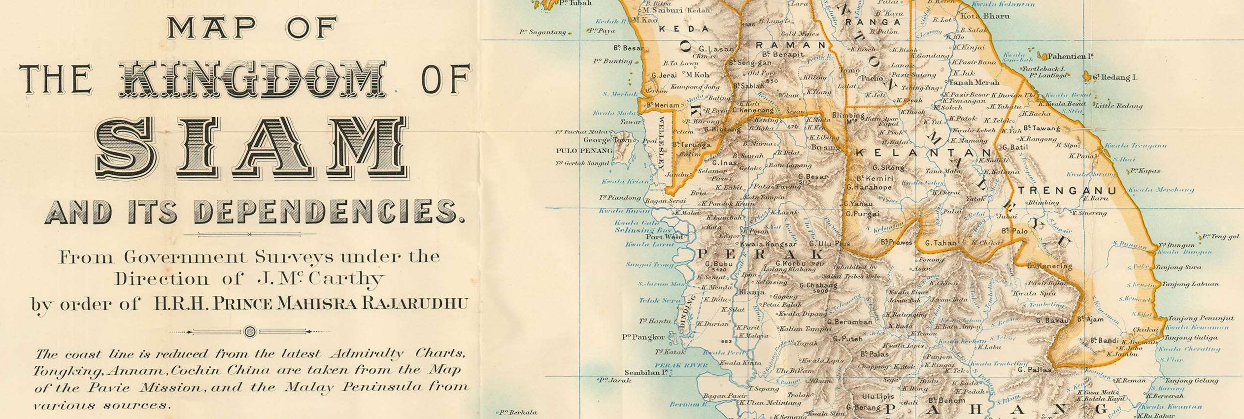
What were once loose collections of Indigenous tribes and bands with their own languages, cultures, and methods of relating to people and place, were bundled together and sold to the world under a new brand by a King who adopted westernized approaches to place making, land disputes, and military defense. Over time, this reinvention included changing the name of the country from Siam, a name attributed to this region in European maps dating back to the 1600s, to Thailand in 1942 – a seventy year old rebranding project. The only thing left of Siam in western language and culture, that I know of, is the informal name for conjoining siblings - Siamese Twins.
One of the forces that accelerated, amplified, and solidified country brands were advances in printing technologies. Territorial names, maps, and their corresponding historical and cultural narratives became the words and symbols that comprised branding elements. Having a tidy, identifiable polygon made of a thick defining line, a perimeter that both divides and unites, offers governments a distinct image – a logo. A symbol that is used, like all logos, to represent a particular system of values, cultures, political structure, and economic systems, all based on a particular historical perspective and narrative as defined by the dominant ruling party. An image so simple, yet powerful, that it need only exist as a single color. Which, in turn, makes it easy and cheap to print in mass quantities and disseminate through mass media. The more the image is exposed, the more recognizable it becomes, and the more easily it is recalled at the mention of it’s name. Just like a logo.
Given the efficiency of a logo, they’re easily incorporated into many forms of advertising, propaganda, and education. But it takes more than a single image to communicate the complicated doctrines and causes that stand behind a simple shape. That’s what national atlases are for.
ATLAS PLUGGED
Along with the advances in printing technologies came the proliferation of national atlases. In the History of Cartography, Volume Six, Karen Culcasi positions atlases like this,
“…atlases have several roles, but their classic function is as a symbol of nationhood, national unity, and national pride. While the defining criteria are ambiguous, most national atlases are collections of thematic maps of an independent country. In addition to historical maps that narrate the nation-state’s past, they typically include statistical and physical maps as well as general reference maps covering the country section by section at a somewhat larger scale—all of which enhance their power as pedagogical and reference tools for use in homes and classrooms.”3
The first national atlases most likely emerged out of England in 1579; Christopher Saxton’s Atlas of England and Wales. It’s a colorful book of maps gilded in gold and commissioned by Queen Elizabeth I to demonstrate British cartography and engraving prowess. It served as the base map for future national atlases of England and an inspiration for others to follow. Soon Scotland, Finland, Canada, and the United States had their own. In the centuries to follow, nation states around the world who gained their independence were quick to follow up with a national atlas. But they aren’t without conflict. One of the most recent notable territorial conflicts is also one of the oldest. Israel and Palestine.

The boundary mapping of Israel and Palestine, like other boundaries in the region, continues to be contentious with no apparent conclusion through traditional means. Steeped in thousands of years of ebbing and flowing of ethnic, religious, refugee and natural resource boundaries and interactions its complex reality exceeds the limitations of traditional cartographic conventions.
The first internationally recognized boundary in the Middle East was created in 1906 by Great Britain who were governing Egypt at the time. Again, for military purposes, they wanted to control the Suez Canal so the surveyed a border that awarded them the Sinai Peninsula. Then in 1916 the English and French met in secret to create a dividing line between Egypt and Turkey. Egypt went to England and Turkey went to France.

That worked so well, that in 1920 they met again to divvy up more land in the middle east. Lebanon and Syria would go to France, and Palestine and Mesopotamia to England. In 1923 the League of Nations declared Palestine a state, an England mandate, and the line originally drawn in 1906 between Palestine and Egypt remained.
In 1947, the United Nations recommended a plan to divide Palestine into two “independent Jewish and Arab states.” The Jewish organization that had long been helping resettle the area begrudgingly accepted the proposal, but most of the Arab contingent did not. In 1948 the British mandate expired, hundreds of Palestinians were expelled, 78% of the land was handed to Israel and before the year was up the region had their first Arab-Israeli war.
In 1949 a temporary ‘Green Line’ was agreed upon by the Israeli’s and neighboring Arab countries. Its name comes from the green ink used to draw the line. But what I recall is the green line of pine trees that stop at the border between East Jerusalem and West Jerusalem. These trees have mostly been purchased and planted throughout Israel by the Jewish National Fund – a nonprofit started in 1901 to buy up land in Palestine for Jewish settlement.

The Green Line lasted until 1967 and the Six-Day War. Israel captured territories that we all know by name, but most couldn’t place on a map: East Jerusalem, the West Bank, Gaza Strip, Golan Heights, and the Sinai Peninsula (which went back to Egypt in 1979). Contentious struggles continue to this day. The latest 11-day deadly skirmish was over territorial disputes in the Gaza Strip.
In 1996 Haifa University Geography professor, Yoram Bar-Gal researched the maps Israeli schools were using to teach kids the area’s geography. He also looked at how the media, Zionist organizations, like the Jewish National Fund, and the Israeli government used maps to ‘assert territorial socialization’. He also looked at textbooks published in Arab countries to educate their kids and citizens. No surprise. What he found is each side uses maps and names that reflect their cultural identity. Maps from the Arab countries called the region Palestine and the Jewish maps called the region Israel. In 2004, the American Jewish Community created a pamphlet targeting textbooks created in Syria, Palestine, Lebanon, and Saudi Arabia asking,
“How can there be peace in the Middle East if Israel isn’t even on the map?”4
These maps that each side have created can be construed as propaganda pieces. They each deliberately use names, labels, and language to systematically shape opinions, beliefs, and perceptions. That also sounds like the building of a brand using a map as a logo. Go search for a Palestine necklace with a map and see what you find. Then search for an Israeli necklace with a map. A logo with the same shape, but different meaning.
FLEXIBLE, FUZZY, AND FLUID
When I was working in Excel on the built-in mapping feature, we had contemplative discussions about how to one day solve this sticky dilemma. Imagine you’re at a conference in Hong Kong presenting to an audience of mixed Asian descent – including Taiwanese. One of your slides includes a map you made in Excel of the population of Taiwan that includes that name on the map. Given China has not recognized Taiwan as a nation, many Chinese in the audience would take offense with how you labeled the map. But if at the last second you decided you should call it China, the Taiwanese in the audience would take offense. Given the presentation is happening in Hong Kong, should the map automatically select the name their government prefers? And what about you? What do you believe? Given this is your work, shouldn’t it reflect your personal belief? Or should it reflect the company you work for. It’s their laptop, their license of the software, and you were paid to make it. There’s no easy answer.

In 2016 two geography researchers, Garrett Dash Nelson and Alasdair Rae, explored an alternative. They looked at commuting patterns across the United States and with the help of a computer determined regions based on human activity and not historical cadastral demarcations. It revealed familiar and logical grouping and names that anyone familiar with America could understand. But the shapes are counter to what Jefferson could ever have imagined. Still, the resulting shapes, while based on dynamic human patterns, are still fixed regions based on both man and machine interpretation. The authors conclude,
“The detection of recognizable communities through this computational analysis suggests that human geography does in fact display statistically-significant patterns of structured regionalization…Such empirical analyses provide a scaffolding on which policymakers can evaluate the appropriate territorial shape and size of districts…Given the massive complexity of the connections inherent in national-scale commuter geography, these analyses should be understood as” providing only a sketchy foreshadowing of possibilities and “must then be subject to functional and practical scrutiny.”5
This all puts in to question the legitimacy of a nation-state in the first place. Inventing connected lines that make a recognizable shape, giving it a name, deciding who can live within its imaginary border neglects the reality on the ground. Nature doesn’t care about our maps. And, after all, we are part of nature. It is true that every complex system in nature has some organizing mechanism that creates and coordinates order. Just look at our DNA.
But territory maps, like logos, have strict guidelines, rules, and laws that defy the fluidity of human behavior, culture, and civilization. Humanity is a puzzle made of pieces that continually change shape and interlock and reject each other in unexpected and surprising ways. It may be impossible to map such a thing. Perhaps traditional cartography, as we know it, is ill-fitted to the task. A convention seeking adaptation. Or maybe collective greed, hatred, delusion, and hubris on the part of some have led us to believe a map can be a logo and that a nation can be a brand.
Anderson, Benedict R. O'G. (1991). Imagined communities: reflections on the origin and spread of nationalism
ibid.
ibid.
Dash Nelson G, Rae A (2016) An Economic Geography of the United States: From Commutes to Megaregions.


