


Hello Interactors,
We’re learning every day just how embedded racism is in the workings of American polity. My recent posts have picked on the history and influence of America’s cadastral and topographic cartography. Today I weave together European scientific determinism, early ‘big data’ authoritarianism, and White supremist cartography.
As interactors, you’re special individuals self-selected to be a part of an evolutionary journey. You’re also members of an attentive community so I welcome your participation.
Please leave your comments below or email me directly.
Now let’s go…

CARL IN ALBUS PHYSICUS (CARL THE WHITE SCIENTIST)
Our world is filled with data. There’s so much data that we came up with huge word to describe it – Big. Ok, a three letter word that happens means a lot. ‘Big Data’ is a big deal these days. We can’t seem to ever get enough data. More data seems to be more better. Scientists have been collecting, categorizing, and classifying data for hundreds of years. It’s the basis of the scientific method and our appetite for more data doesn’t seem to be waning.
One of the most influential scientists in the early days of systematic data collection and classification was the father of taxonomy, Carl von Linné. He wrote in Latin, so he liked to go by Carolus Linnaeus. The word taxonomy has Greek origins: taxis (arrange) nomia (method). The method of arranging. Not to be confused with taxidermy. That’s the arrangement of skin. Linneaus was a Swedish botanist, zoologist, and taxonomist who wrote a very popular book called Systema Naturae. The first edition came out in 1735, but the one that really caught steam and spread around the world was the tenth edition in 1758. That was the one where he dedicated five of the over two thousand pages to the following taxonomy of homo sapiens:
Homo americanus
Homo europaeus
Homo asiaticus
Homo africanus
As you can see, he assigned a geographic association to each name: America, Europe, Asia, and Africa. It was commonly believed by Christian scientists during these times that humans were shaped by God to fit in their environment; including the shape of their bodies, color of their skin, behavior, and how they governed themselves. As Linneaus often said, "God created, Linnaeus organized." Brad observes that Carl also spoke in the third person. Here’s how he organized and described God’s homo sapiens indigenous to their land:
“Americanus: Red, choleric and straight. Straight, black and thick hair; gaping nostrils; [freckled] face; beardless chin. Unyielding, cheerful, free. Paints himself in a maze of red lines. Governed by customary right.
Europaeus: White, sanguine, muscular. Plenty of yellow hair; blue eyes. Light, wise, inventor. Protected by tight clothing. Governed by rites.
Asiaticus: Sallow, melancholic, stiff. Blackish hair, dark eyes. Stern, haughty, greedy. Protected by loose garments. Governed by opinions.
Africanus: Black, phlegmatic, lazy. Dark hair, with many twisting braids; silky skin; flat nose; swollen lips; Women [with] elongated labia; breasts lactating profusely. Sly, sluggish, neglectful. Anoints himself with fat. Governed by choice [caprice].”1
Linneaus ended up printing thirty editions of Systema Naturae all the way up to 1793. His geographically assigned taxonomy of humans became the defining standard of how the world came to categorize people. The word used to describe the taxonomy of the physical and behavioral characteristics Linneaus assigned to homo sapiens dates all the way back to the 1500s. That word is ‘race’.

BIG DATA, BIG COUNTRY, BIG MAPS, BIG PROBLEM
Given the geographic binding to race, it should come as no surprise that cartographers in Europe and America were quick to map these races. I spent the month of April talking about the history of America’s survey system and the gridding of the land for purposes of taxation and White colonial settlement. It started with Jefferson’s Land Ordinance act of 1785. But another American survey was started in 1790 that has also resulted in the creation of maps. It’s even written into the U.S. Constitution. It’s the census survey.
Just as America was the first to yank large scale cadastral mapping out of Roman times to build an empire, the U.S. was the first to utilize the census to reapportion government representation as the population grew. The U.S. House of Representatives grew steadily more or less in a straight line from the first census in 1790 to just before 1920. It’s been flat ever since. Despite the fact our population has more than tripled since then. I know big government is very popular these days, but clearly we’re not all duly represented in Washington D.C.
Nineteen-twenty also marked the year the sagging line of rural dwellers crossed the climbing line of urban dwellers. Today over eighty percent of the U.S. population lives in urban areas and that number is expected to grow exponentially. Another surge in U.S. population occurred in the mid 1800s as land across the country became increasingly easy to settle. As I mentioned in a previous post, a pioneering White settler could approximate a survey of 40 acres of land to call their own in under a day.
But the influx of foreigners was troubling to many. The complexion of the country was changing rapidly. By the late 1800s, the census bureau was pressed to not just count but also classify, diagram, and map the myriad of ethnicities flooding the country from Europe and Asia. Many of whom were migrant laborers building the nation’s railroad. Government statisticians scrambled to find ways to accurately define and model the data. As cartography historian Jeremy Crampton notes,
“The superintendent of the 1870 and 1880 U.S. Census, economist and statistician Francis Amasa Walker, explicitly remodeled its data collection to track what he saw as worrying immigration trends.”2
You could argue the 1890 census was the beginning of ‘big data’ in America. The eleventh census was the first to be tabulated with punch cards. A gentleman named Herman Hollerith invented the punched card tabulating machine in 1884. He went on to found a company called the Computing-Tabulating-Recording Company. Thirteen years later in 1924 it was renamed ‘International Business Machines’ or IBM.
One of the many holes in those 1890 punch cards was for ‘race’. The census in America has had a long history of changing ethnic classifications every census or two. The first census in 1790 had three: ‘Free white females and males, other free persons, and slaves.’ In 1820 ‘free people of color’ was added. Then, in 1850 back to three, but a different three: ‘Black, Mulatto, and White’. And then, in 1890 it was: ‘Indian, Chinese, Japanese, Black, Mulatto, Qaudroon, Octaroon, and White.’ Quadroon and Octaroon were considered one quarter or one eighth African and the rest European blood.
All this data needed to be communicated efficiently. Not just to the government, but to teachers too. These census publications play a key role in teaching students across the land a particularly one-sided quantitative narrative of American history. To do so effectively, this big data needed much clarity, so they turned to the people best suited for the job; cartographers.
Not just any cartographer, but the father of American cartography, Henry Gannett. I introduced Gannett in last week’s post. He had pioneered the quadrant topographic survey system and then joined the census for the 1880 survey. He introduced a regional division scheme for the census that corresponded to the newly formed counties thus aligning census data to politics. The revised scheme looked to the past and to the future. It allowed for data to be compared to previous census collections and is still in use today.
TAKING STOCK OF AMERICA’S STOCK
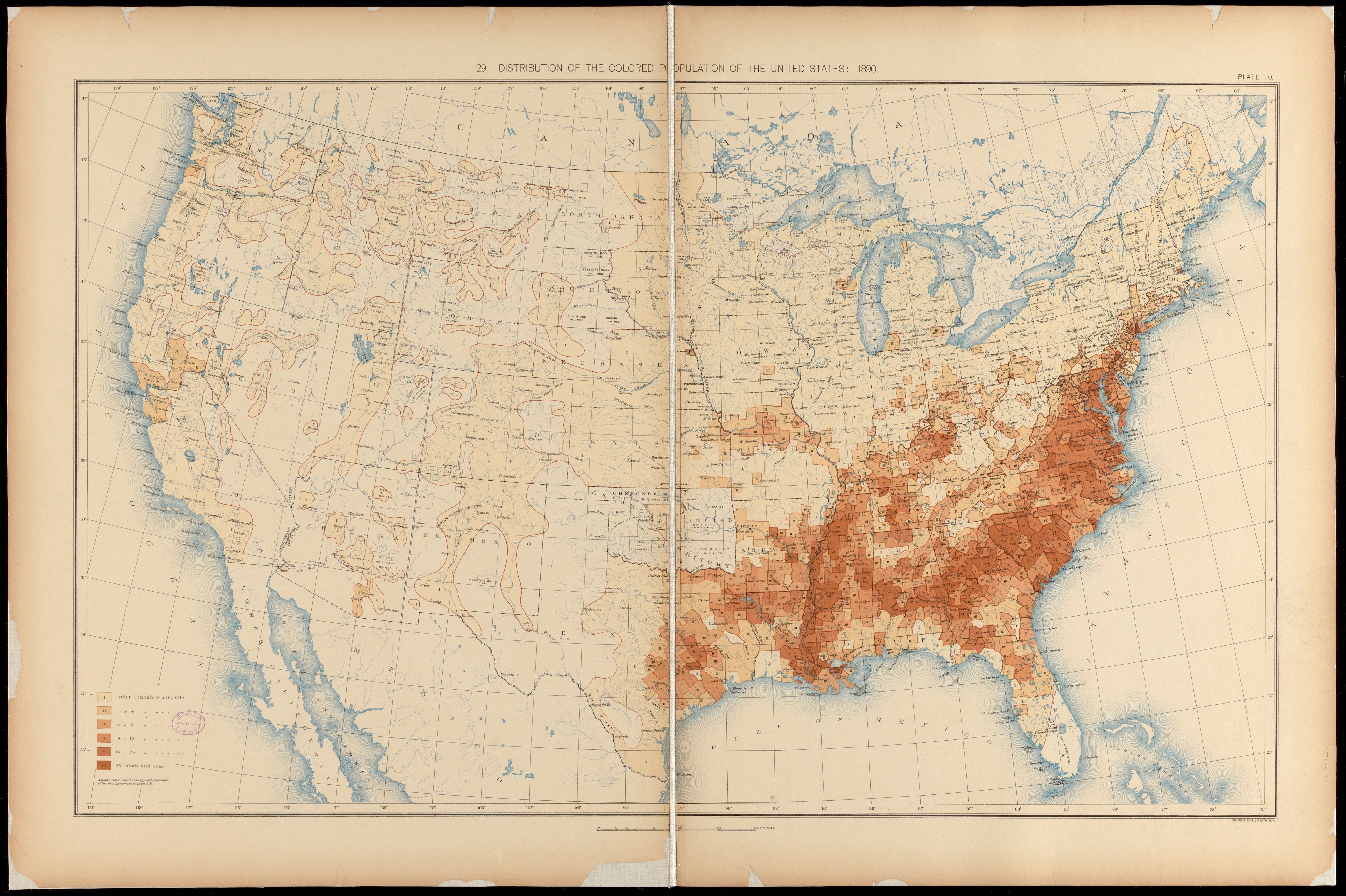
The 1890 census was the second survey to include maps and the first to be signed by Gannett. The Library of Congress has Gannett’s entire Statistical Atlas of the United States Based upon the Results of the Eleventh Census online. I highly encourage people to flip through the pages and zoom in on the illustrious maps, diagrams, and charts Gannett and his team prepared. The deep coloration of lithographic pigmentation that comprise the overlapped layering of isarithmic, choropleth, and dasymetric maps saturate the thirsty, bleached white paper making digital cartography look flat and lifeless.
This census report is filled with statistical information and analysis. Part one covers gender, ethnicity, race, birth origins, parentage, schools, military, voting, marriage status, and family dwellings. Part two looks at age, school attendance, illiteracy, occupations, and citizenship. Piles of punch cards, mountains of data, and a looming worry that immigrant populations were about to tower over ‘White natives’.
Gannett’s team devised a simple diagram to communicate the magnitude of the tower. They made an area chart showing ethnic and racial categories on the horizontal axis and time on the vertical. The category names chosen and listed along the bottom were: ‘Colored’, ‘Native stock’, ‘British’, ‘Irish’, ‘German’, ‘Scandinavian’, ‘Canadian’, ‘Poles’, ‘Hungarian’, ‘Italian’, and ‘Others’. Forming their own sort of taxonomy, they collapsed the European categories into a larger category called, ‘Foreign stock’.

The resulting area chart then compares ‘Foreign stock’ (both newly immigrated and settled), ‘Native stock (these are descendants of original European colonial settlers – mostly British), and ‘Colored’. True Indigenous ‘Native stock’ of this land were not counted in the census until 1860, but only if they had ‘renounced tribal rules’.3
The data runs from 1790 at the top (the nation’s first census) to 1890 at the bottom, the date of the eleventh census. The overall shape of the chart is what you’d expect. It’s narrow at the top and grows wider toward the bottom. It takes the shape of a tall, skinny mountain comprised of three distinct bell-bottomed vertical bands. The mountain top includes two of these bands, ‘Native stock’ and ‘Colored’ with ‘Native stock’ dominating. These are descendants of original White colonial settlers and their slaves. The British descendants of my long lost grandpa, Jonas Weed, would have checked the ‘Native stock’ box on their census survey.
The ‘Foreign stock’ vertical band doesn’t show up on this mountain of census data until around 1835. My Scottish, Irish, and German descendants would have checked this box. The total number of ‘Foreign stock’ grew exponentially from 1835 to 1890 and this worried the dominant ‘Native stock’. This is why census statisticians modeled the data in a way that Gannett and his team could visualize it. They wanted to get a handle where these folks were settling and in what numbers. So Gannett made maps too.

Some of the concern with immigrants wasn’t just their burgeoning population growth, it was the growing sentiment that they were not as “pure” as the White descendants of the original Anglo-Saxon colonizers. And the pairing of race to cartography and the mass distribution to schools nationwide helped spread this belief. Including the American Geographical Society who had been tasked since 1850 with expanding geographic knowledge across America. Again, Jeremy Crampton writes,
“…the American Geographical Society (AGS) played a significant role in promoting racial and eugenicist views. These were often part of a narrative of the threat of immigration from populations considered unhealthy, degenerate, or otherwise undesirable.”4
The influence continued through to the twentieth century. The 1917 president of the Association of American Geographers was Harvard geographer and climatologist Robert DeCourcy Ward. He was also a eugenicist who cofounded the Immigration Restriction League in Boston in 1894. DeCourcy was a Mayflower descendant and he and his cofounders believed southern and eastern European immigrants were inferior to them and their fellow Anglo-Saxons. They believed the increasing presence of these immigrants was a threat to what they considered to be the ‘American way’.
Eugenicists seek to rid populations of people they deem physically and mentally unfit, unhealthy, and degenerate so their blood won’t mix with the pure bred White Anglo-Saxons. This was about the time a certain twenty-eight year German soldier, Adolf Hitler, wrote in his diary while recovering from a British mustard gas attack,
"When I was confined to bed, the idea came to me that I would liberate Germany, that I would make it great. I knew immediately that it would be realized."5
WRAPPING A RACIAL TRAP INTO A MAP
The liberation of racial editorializing of the U.S. census has also being realized. In reading Gannett’s 1890 census survey I am impressed with the objectivity he and his statistician colleagues presented. It’s an impressive undertaking. But I can’t help but notice tinges of racism creeping in – at least by today’s standards. It’s racism nonetheless. Consider the section entitled: Defective, dependent, and delinquent classes. Here’s a section of their analysis of the ‘insane’.
“Of the native whites, 14 out of every 10,000 and 39 out of every 10,000 of the foreign born were insane. If these statistics are correct and complete, insanity is less prevalent among the colored and far more prevalent among the foreign born than among the native whites.
Diagram 191 illustrates the tendency toward insanity among people of different nationalities. It represents the number of insane person in every 100,000 of those whose parents were born in certain foreign countries.
The tendency toward insanity is greatest among the Irish, and next among the Hungarians. It is comparatively small among the Germans and British, and least of all among the Canadians.”
O Canada, with glowing hearts we see thee rise. It’s true, I’ve never met more sane people than Canadians.
Unlike the 1880 census, where physicians provided reports of the mentally ill, the 1890 did not. As a result the numbers are undercounted relative to 18806, but it begs the question; who supplied the data and how reliable was the source? And did they have a motive?
Perhaps not. After all, in reporting on the ‘feeble-minded’ they state ‘Native whites’ are number one.
“Of the native whites, the corresponding numbers were 17 (per 100,000), and of the foreign whites 10 (per 100,000), which shows, if the figures are to be trusted, that idiocy is more common among the native whites than among the colored or foreign whites, and least of all among the foreign whites.”
A bold admission! But wait, there’s more.
“The explanation of this is most probably to be found in the fact that idiocy was more fully reported by the native whites than by these other two classes.”
This indeed may be true. Self reporting surveys are notorious error prone. But then that would render all of the census data suspect and not just those data that might make you look feeble minded.
As summer approaches and echoes of George Floyd protests still echo across the nation, the section on mortality in the 1890 census reveals some curious facts regarding what were then called ‘negroes’.
“[The death rate] of the negroes is the greatest of all. The rural death rate is but 15 (per 1,000), and is greatly exceeded by the urban death rate, which among the whites is 23 (per 1,000) and among the colored 34.5. Diagram 207 shows the death rate of the white and colored in certain southern cities where the negro population is large. From this it appears that while the death rate of the whites ranges from 18-25, that of the colored ranges from 30-42, being in each case nearly double that of the whites. It is probably, however, that this proportion between the two holds in the rural districts, which are better suited to the development of the negro than the environment of large cities.”7
In a refrain of Linneaus logic, it seems nineteenth century data scientists still believed race was a function of geography. Either it was inconceivable that Black Americans were victims of race violence at the hands of White supremacists who by 1890 would have been more than evident. The KKK emerged out of opposition to reconstruction. While they were suppressed legally by the federal government in the 1870s, these fearful eugenic fascists didn’t just disappear. It’s probable that many of them even found their way into southern urban police departments.
There is no mention of lynching whatsoever in the mortality section. Lynching had been occurring since the end of the Civil War and was in full swing by the time the 1890 census would have been conducted. Racial terror is one of the many factors that led to droves of Black Americans migrating north. They were literally running for their lives.
It’s easy to cherry-pick examples of racial and ethnic injustices from the annals of history. But it’s even easier to ignore it. Silence, after all, is a form of violence. It’s meaningful to me to know that the people behind those maps that were, and still are, coiled up in tensioned rolls above chalk boards and white boards that adorn our public schools were started by White supremacist eugenicists. And it wasn’t that long ago. My grandparents would have been teenagers when the American Geographical Society was shipping atlases to their one room schools in their freshly surveyed townships in Iowa.
And Brad shouldn’t give Linneaus too much grief. His taxonomy invention made Charles Darwin’s life a lot easier. But he made little to no effort to even meet these Black, phlegmatic, lazy, Dark haired, Fat lipped homo sapiens. He never traveled south of the Netherlands and never left Sweden after age 42. He wasn’t a fan of scientists visiting other countries. This quote sums it up in a paradoxically named book Carolus Linnaeus: The Swedish Naturalist and Venerable Traveler. He admonished Swedish scientist who traveled outside of Sweden telling them “[not to] cross the stream for water, and waste... money endeavoring to learn in a foreign country what... might have [been] acquired at home.”
Why risk actually observing and interacting with Indigenous Americans, Africans, or Asians? Probably because his tight protective clothing against his White, sanguine, muscular body would cause him to profusely sweat in hot and humid climates. Or perhaps his plentiful yellow hair and blue eyes would wither in the sun. He may have been a light and wise inventor, but curious and introspective he was not.
As we continue to amass infinite amounts of data and rely on statistical methods to abstract, and reason away emergent patterns. Calculations so complex that no human can ever understand them. Let’s not loose sight of our humble interactions with people and place.


Share this post