Hello Interactors,
Last Sunday I ‘rabbit-holed’ on the origins of Easter. That led me to Passover, and then Ramadan. The origin stories all involve the movement of people, or their ephemeral equivalents, through space over time. And they all share a ‘common interest’ in one of the most ancient cities on the map — Jerusalem. Is there a map for that?
As interactors, you’re special individuals self-selected to be a part of an evolutionary journey. You’re also members of an attentive community so I welcome your participation.
Please leave your comments below or email me directly.
Now let’s go…
MAPPED OUT
Spring has sprung, Easter Pass(ed)over, and Ramadan lingers on. Last week Christians celebrated the rising of their messiah from a tomb, Jewish people celebrated the exodus of their people from slavery, and Muslims continued to gather, contemplate, and fast. It’s rare these three holidays occur at once. The Islamic calendar of 354 lunar days cycles with the moon through the 365 solar days of the Christian calendar allowing the these three religious holidays to coexist every three decades.
The histories of these religious traditions are all rooted in the interactions of people and place. Ramadan celebrates the night the Quran was passed down from above, Easter stems from the Germanic goddess Ēostre who rises to coax the sun to return, and Passover is from the Hebrew word pasha meaning “he passed over” commemorating the angel of death passing over them.

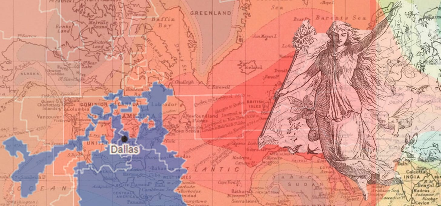
People pass over terrain every day around the world. As Ēostre rises the sun warms the earth and people begin agitating, moving, traversing, and colliding like molecules being heated by the sun’s radiation. As the earth rotates waves of interactions between people and place rise and fall with the sun, rolling across the earth’s surface in perpetual motion.
And yet our maps sit still. They are static moments of effervescent daily life frozen in time. Google Street View offers snapshots of people living their lives; unforgiving they strive, pixels blurring their eyes. But our world is anything but static. And yet our lives depend on fixed representations of us and all that surrounds.
Take electoral district maps as an example. Every ten years, when the U.S. census is taken, the federal and state governments are required to reapportion the number of seats in the U.S. House of Representatives and State Legislatures to match the current population. Accordingly, they’re also required to map numerically equal districts in the spirit of neutrality in a process called redistricting. Here’s an interactive redistricting map from FiveThirtyEight.
It is seemingly impossible to be impartial in the remapping of these districts.1 Various subgroups of the general population are advantaged while others lose out. The system tends to bias regions with economic vitality because they typically attract the most people. Those people most advantaged economically are also those who are most mobile. Those less mobile tend to be more economically disadvantaged and are usually low-income, minorities, less educated, and skilled laborers in declining industries and geographies.
The rich get richer, the poorer get poorer. Those who are mobile, move; and those stuck, are out of luck. One piece of research from 2019 by two political geographers reveals that “that districts with the fastest rate of growth have a higher level of affluence.”2 This means the ‘winners’ will gain house seats while the ‘losers’ lose seats. Their research looks at the 89 U.S. House seats that have shifted due to redistricting since 1960. Their results shows that,
“Rewarding population growth means rewarding certain interests that produced it, the converse is true for punishing population loss. This is an underappreciated point among the many who think that a population basis for apportionment is problem-free and self-evidently superior to any other scheme.”3
WIGGLE ROOM
There are many rules applied to generating electoral district maps by the states, but according to the Loyola Law School the most common is Contiguity.4 There are 45 states that stipulate districts must be contiguous. In other words, a district can’t have an island floating inside another district. Borders must be adjacent.
The next most common rule is adherence to Political Boundaries “to the extent practicable”. Thirty-four of the states have this as part of their state constitution or statute. This means a district map has to attempt to align its boundaries to county, city, or town lines.
Compactness is another rule or guideline. They say, “scholars have proposed more than 30 measures of compactness” and that, “32 states require their legislative districts to be reasonably compact; 17 states require congressional districts to be compact.” Idaho appears to have the most specific definition of ‘compactness’ stating officials, “should avoid drawing districts that are oddly shaped.” I honestly have yet to see an electoral district map that is not oddly shaped. It turns out ‘compactness’ is a matter of opinion. Just look at Texas!
Communities of interest also commonly show up in districting rules. There are 15 states that consider keeping “communities of interest” whole when drawing state legislative districts; 11 states do the same for congressional districts.” Those with a ‘common interest’ are people who share the same interest in a given piece of legislation. Just last May Kansas reinstated their guidelines and criteria stating:
“There should be recognition of similarities of interest. Social, cultural, racial, ethnic, and economic interests common to the population of the area…should be considered.”
Given these popular rules, it’s not hard to see how poor people and ethnic and racial minorities are literally excluded from representation. It’s also easy to see how redistricting amplifies political partisanship. The U.S. Constitution says little about how to limit these powers. And while the Supreme Court have stated excessive partisanship is unconstitutional, they’ve also “explicitly blessed lines drawn to protect incumbents, and even those drawn for a little bit of partisan advantage”5 Moreover, they’ve said they will not consider claims of extreme partisanship claiming there is no legal way to determine how much is ‘too much’.
But I’m not certain there is a fair way to map representation using static maps that assume constituents somehow live, work, pray, or school within an electoral district. Perhaps it’s possible in some rural areas, but I go through three congressional districts and four state legislative districts just to get to the airport. To be ‘contiguous’ and ‘compact’ the district lines go down the middle of Lake Washington. Do the people I see on the other side of the lake really have different ‘community interests’ than mine?
It was Thomas Jefferson who pushed to violently displace or exterminate Indigenous people, possess their land, and then grid it up to be sold (or given for free to homesteaders), farmed, and then taxed. After all, he was a farmer with an agrarian vision of colonial settlements across the country featuring schools, churches, and a government seat within ‘political boundaries’. You can read just how easy it was for settlers to grid their own property in a piece I wrote last year called, Make Your Own Survey in Under a Day.
While these people mobilized across the country, farmers and settlers were not that mobile relative to today. Early settlements were naturally ‘compact’. ‘Common interests’ were instilled through fear. Settlers banded together despite their ethnic or religious differences because they fretted over when and where the original occupants of the land they were farming may return hostile and violent demanding their stolen land be returned. And ‘contiguity’ would have been easily achieved given the rectilinear plots they platted.
Territorial and electoral mapping became more complicated the more complex American societies became. Trains, streetcars, and bicycles made it easier for people to travel longer distances to live and work. The ‘common interests’ became more diffuse with each advance in transportation and wave of immigration. I can see how a politician might wish to squiggle the square on a map to wriggle toward voters to tap.
Wriggle as they may, their constituents wiggled more. Now we have evidence that mobility and affluence are linked to partisan political maps that advantage the advantaged at the expense of ‘others’. We also know that lower income people are often priced out of affluent areas to suburbs, exurbs, and even rural areas. They are forced to live in areas often very different than where they work. Are their ‘common interests’ really relevant to their legislative representation?
For example, if poorer people must rely on public transportation to get to and from work or school, are local, state, and congressional politicians in suburbs, exurbs, and rural areas really going to listen to their complaints about equitable transportation? Will they get fair ‘legislative representation?’
And increasingly, for some, the pandemic has made it possible to live and work in wildly different places. What does ‘compactness’ or ‘communities of interest’ or ‘contiguity’ look like on a map under these dynamic conditions? Mapping for the purpose of political representation, taxation, and even urban and transportation planning assume built environments are as permanent as the physical earth in which they arrange themselves. Even a decennial census admits to a certain pace of life that is inconsistent with the increase in mobility, technology, and, unfortunately, climate change and economic inequality.
MAPPING SPACE AND TIME
There are some who have been calling for a shift from this stiff short shrift. From as early as the mid 1990s, a leading voice in this choir of change is Michael Batty. He is an urban planner, geographer, spatial data scientist, and professor at the Bartlett School of Planning at University College London. In 2002 he wrote an editorial in the Journal of Environment and Planning titled Thinking About Cities as Spatial Events.
In it he writes,
“It is possible to conceive of cities as being clusters of `spatial events', events that take place in time and space, where the event is characterized by its duration, intensity, volatility, and location. There may be interactions in time and space between events, leading to clusters and other aggregations, but the dominant way in which these descriptions are characterized is clearly temporal.”6
He defines duration as being as short as ‘trip making’ — measured in minutes or hours, to ‘living at a residential location’ — measured in months or years. Intensity could the intensity in which an event impacts people or place. It may be correlated with the ‘compactness’ of people involved in ‘common interests’ relative to those around them. Volatility is the variation in intensity and may be correlated with duration. A white collar worker with a predictable routine (or working from home) would measure as less volatile than a gig worker taking part-time jobs across a given region, country, or the world. Location, then, is the traditional measure and mapping of the terrestrial as well as population scale, size, and density.
In his 2018 book, Inventing Future Cities, Batty dedicates a chapter to The Pulse of the City. Here he talks of a,
“’liquid city’: a place where physical desires, face-to-face contacts, and digital deliberations provide a new nexus of innovation. Flows, networks, and connections, rather than inert structures, dominate this physicality as infrastructure comes to represent this new liquidity built on layer upon layer of flux and flow.”7
He isn’t the only voice challenging traditional static notions of place, Doreen Massey was another. She was a British social scientist and geographer and Professor of Geography at the Open University in the UK. She began her career in the field of economic geography where she focused on social and economic inequities that create stark divisions between regions and social classes. This led her to reconceptualize the sense of space.
In a 2013 interview, she talked about how space is often the afterthought when considering ‘time and space’ in the social sciences. Time is given much attention as ‘the dimension of change and dynamism’ and space is relegated to inert earth ‘out there’ that we ‘cross-over’, ‘devoid of temporality.’ She points to a well held historical position in academia that if the field of history is about time, then geography must be relegated to space. Throughout her career, she worked to change that.
Her research and writing aimed,
“to bring space alive, to dynamize it and to make it relevant, to emphasize how important space is in the lives in which we live, and in the organization of the societies in which we live.”8
She offers this scenario as an example: When we are ‘crossing-over’ ‘inert land’ ‘out there’ in a car or train and glance out the window, we acknowledge we are moving through space and the physical geography is indeed part of it. But our eyes and brains also capture snapshots of people walking across a street, ordering food from a street vendor, or strolling in a park. These moments, like those on Google Street View – these interactions of people and place – are also part of the space.
She surmises that,
“Space concerns our relations with each other and in fact social space, I would say, is a product of our relations with each other, our connections with each other.”9
Mapping these concepts and phenomena is as complicated as explaining it, but dynamic mapping continues to make strides in mapping complex spatial processes.
One of the most visceral examples is this 2014 video of 30,000 airplanes flying in Europe’s airspace over the course of a single day.
And there are tools that help analyze air traffic flow data like this.
Companies like INRIX have been studying traffic flow data on the ground for decades. Their software allows for traffic flow analysis and visualizations using real-time data from vehicles.
When I take the bus I use an app called OneBusAway that shows in near real-time the location of a bus on route from origin to destination.
There are also companies like StreetLight Data who buy anonymized and aggregated location data from mobile phone providers that probabilistically determine traffic flows generated from cars, bikes, and pedestrians.
These are examples of dynamic cartography that approach articulations of Batty’s ‘liguid city.’ They are baby steps toward representing the dynamism Massey sought to better understand our relations and connections with each other. But they lack the richness census data provides and we’re a long way from trusting governments to track us 24/7 365 days a year as part of their routine census collection. Many people already view the census as a personal violation of privacy.
At the same time, our methods are stuck in the past. When Jesus was believed to be rising from his tomb, the Israelites fleeing Egypt, or Muslims fasting as the Quran was handed down it was all happening in cities they believed to be as permanent as the religions they birthed. In the case of Jerusalem, it was. That certainty came under question during the dawning of the Enlightenment and the spread of colonialism. The Industrial Age accelerated the pace of change and innovation in technology and urban design. Society’s pace quickened and cities, and connections to them, acted as civic accelerators.
In 1914 Scottish cartographer and geographer John Bartholomew created an Atlas of Economic Geography for King George V. It included a map that showed how long it would take to get to various places around the globe. It would have taken King George several weeks to traverse the boundaries of his British Empire. You can now do it in a day.
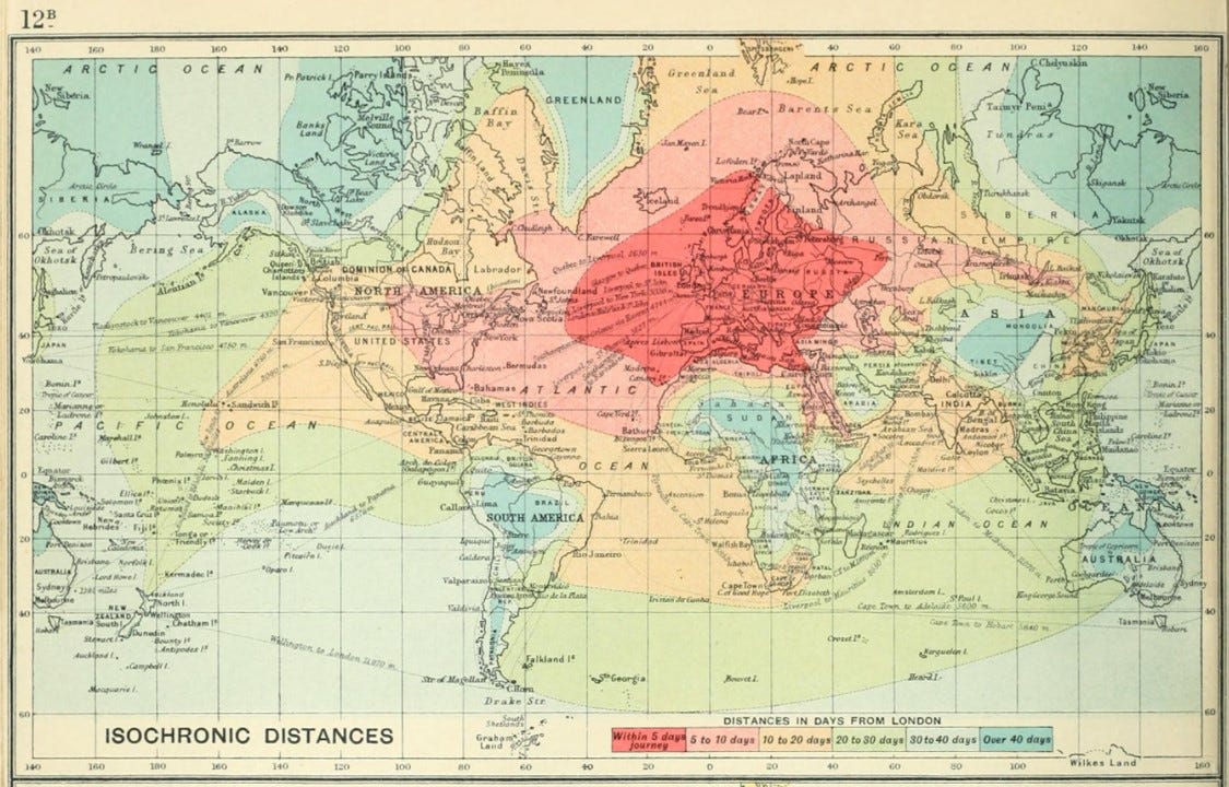
There is a disconnect between the open-ended superexponential growth of ‘political boundaries’ that accelerate our pace of life and the process of determining who governs them. Representative governments are determined by methods of mapping from a bygone era. What does this say about our future?
I’m with Michael Batty when he says,
“I think there is much we need to say about cities as we come to terms with a world that is intricately connected and where information underpins our every act.”
Geographers and Redistricting. American Association of Geographers. Emily Yeh. 2021.
Reapportioning the U.S. Congress: The shifting geography of political influence. Journal of Political Geography. SoRelle Wyckoff Gaynor, James G.Gimpel. 2019
Ibid.
Where are the lines drawn? All About Redistricting. Loyola Law School. 2020.
Ibid.
Thinking About Cities as Spatial Events. Journal of Environment and Planning B. Michael Batty. 2002.
Inventing Future Cities. MIT Press. Michael Batty. 2018.
Doreen Massey on Space. Social Science Bites. Doreen Massey (host Nigel Warburton). 2013.
Ibid.

